Sunday 22 February 2015

Evaluation part 1

The brief I was given was to create a music video for a song of a specific genre of music. A music video is a video which accompanies a song and has a connection with the lyrics and visuals and is done to keep the audience interested. Furthermore a music video is a way in which a song can be promoted, such as a very unique and memorable video so people will remember and buy the song. A music video can be made up of three main areas, narrative, performance and concept.  These types of music areas can overlap and often can be attributed to specific genres of music. For example a rock band such as the Arctic Monkeys having mainly performance and concept based videos, whilst a R&B artist such as Rihanna would be narrative based.
The song which I chose was “It feels like we only go backwards” and is in the album Lonerism and was performed by the band Tame Impala. The particular genre which the song and artist belong to is the psychedelic rock genre, which is very diverse and niche compared to more mainstream genres such as pop. The conventions of the genre are the subjects of psychedelic drugs and having a good time, whilst being individual and not following the crowd. This can be seen in my own video with things such as the time lapses and kaleidoscope effects which I have used in my own video, such as the time lapse in Liverpool Street station with the main character being the focus. Furthermore another convention that I followed was that I used bright florescent colours such as flashing yellow. This can be seen after the character has taken the drugs and I use this to show the audience what the character can see. This is very conventional as bright colours such as yellow , blue and green are a way that the genre shows individuality to the audience. Furthermore as psychedelic and mind altering drugs are paramount to the genre it can be used to show this to the audience.
Another convention which can be seen in my own music video is the use of very unique camera angles such as our time lapse in Liverpool Street station. This is conventional as it gives the audience the impression of how the artist is feeling and that time has stopped, and it shows the audience a different way that he can see the world, which is reflected by showing the audience the time lapse. This can be seen as very conventional to the psychedelic rock genre as it shows the uniqueness of the person and situation against the normality of the rest of the people in the scene.
However I did not want to follow the genre completely as it is possible that I would alienate the audience watching because it was too extreme.  With this in mind I used some unconventional things, such as showing the artists face. Many of the psychedelic rock genre videos do not show faces and they are often masked if they do, this adds to the uniqueness as you do not know who the artist really is. Showing the artists face in my own video will help the audience build a connection with the character, yet is not used in that genre. This would help our target audience of 15-30 year olds feel more comfortable with the video as it is not as extreme and would comfort people more. Furthermore we have done this with dressing the artist normally, in jeans and a plain black jacket, which is unconventional to the genre.  This would help with sales of the album with people who were unfamiliar with the genre as it would not appear too extreme and they would not be put off by the individuality of the video. A further way in which my own video is unconventional to the genre of psychedelic rock is that we have a clear narrative. For example with him breaking up from his girlfriend and him going on to be depressed and leading to his eventual suicide. Many conventional videos have no real narrative and are very unusual with very unclear scenes and having no real link. This would increase our sales as we have made it much more mainstream and open to a much wider audience. This will increase the possible popularity of the band and will help grow the band and sell more music and merchandise, making money for the record label in the process.
Overall my own video could be seen as somewhat conventional as we did not want to lose fans of the genre who had listened to previous conventional music and who would likely buy our album.  However as we did not want to put off people who do not know the genre, as this could be a growing fan base and help the notoriety of the band, we made it less extreme than some of the other conventional psychedelic rock videos . This is the best balance as we have made a mainstream video which is very unique in the way that it is shown to the audience, whilst still being influenced by the genre.  This appeals to as big a target audience as possible which makes financial sense as this gives it the biggest opportunity of selling large numbers of albums.
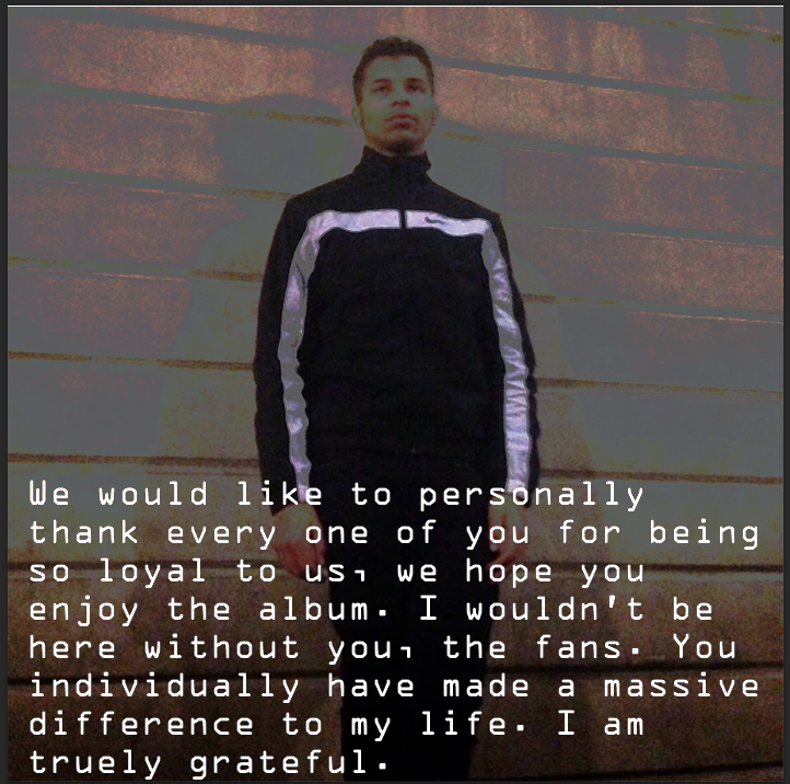
My ancillary texts are also somewhat conventional to the genre and a toned down version of conventional psychedelic rock genre. My digipak consists of 6 pictures of different things but uses things such as pictures of where the artist visits in the video. These pictures are of places such as Liverpool street station and have many effects which have been used to alter the picture. With the only exception being the front cover which is a picture of a scenic cloud with tints of purple and we can see the shape of a rhino in the cloud to relate to the band name “the white rhino”. The album advert is the same as the digipak front except we have the album name in a slightly different position and the words “out now” on it. This is quite simplistic but gets all necessary information across. This design shows how it is part of the psychedelic rock genre, but is not to extreme that it would alienate people which would prevent people from buying it.

Final Evaluation


Thursday 5 February 2015

Final Group Advert

Final Group Digipak


Final Group Music Video

West Hatch High School- 16807

Benjamin Yarwood 3184

I also worked alongside :
                                       Harry Hyett- 3242
                                     
                                       Jazz Chrystie- 3214
                                     
                                        Luke Durrance-3224 

Saturday 3 January 2015

Group Digipak- Miss Georgiou

Group Digipak

When we started creating the digipak we decided that we would use the same methods as with the group advert in that we would pick the best panels from each of our own digipaks and try to make them into one. This would make the digipak easier to do in that we all had an idea of what we wanted and we could take elements from each digipak and use them. We did this by showing the group our personal digipak and then picking the best from the group. This would result in a much better digipak than if we were to start again with a blank canvas with all of our ideas.


With our first panel we decided to use Luke's front cover with a few alterations to make it fit in easier with the rest of the panels. The main thing we decided to change was have the rhino in the picture , with it in the clouds. We did this as we felt it would be memorable for the audience as it is so unusual and would stand out against more normal covers, whilst still giving the audience something to remember the band name with. Furthermore this would make it conventional with our genre of psychedelic rock in that it relates to the use of psychedelic drugs with surreal images. We also altered the colour so that it was a more prominent shade of purple and pink which we felt gave a sense of what the album will be like in that it is surreal and like a dream.  In this way we can see that we have definitely conformed to the genre of psychedelic rock in that we have used many of the characteristics that often appear in other conventional videos. We have done this as we feel it will intrigue people who are unfamiliar with the genre whilst interesting people who know of the genre from previous artists. The layout we have used is very simple, but we feel as a group that it is good and effective as we try to keep as much attention on the important things in the cover, which is the band name and the name of the album. The only other thing we believe is important is what impression the album cover gives, which is a surreal relaxed feeling that we believes gives a good impression of what the songs on the album are about. The typography used is very basic with a simple white font which makes it easy to read and readable at a distance which is needed with a cover. Furthermore we did not want to dominate the cover with a dark font as this would not be conventional with the genre of psychedelic rock. Overall it is very conventional to the genre and is a good way of showing the characteristics of the album. This in turn will promote the artists effectively in that it appeals to people who like the genre and those that are unfamiliar but will be intrigued by the unusualness of the design.


We have decided to use this picture as we believe that the audience would want to see the places that the artist has visited in the music video. Furthermore this is why The only part of this picture which we changed was some of the contrast in the editing , which we did to try to keep a theme with some of the other panels. The colours used are bright oranges and blues with dark contrasts of black and grey , which we feel gives a representation of the artist and song in that the artist has such mixed feelings. This will also appeal to the audience in it will make the audience see the images of how the artist sees them in the video. The image is of the view from outside Liverpool street station and we have used this as it gives the audience an opportunity to have a better view at the various images that are seen in the video. The layout of the panel is very simple with just a picture of a view from the artist point of view.There is no text or writing in this panel as we felt we wanted the audience to focus purely on the image. This is very conventional with the genre of psychedelic  rock in that it uses bright vivid colours, which are used as it often represents the use of drugs on images such as with the contrast on our video. Additionally the image is very surreal with a image that is which unusual and has a different perspective.  This picture was taken from Harrys digipak with only a small amount of change, so we have been successful in making it into our group digipak. One possible weakness we felt was that the image did not show the artist in any way , which may not help with promoting him.


We have decied to use this panel as we believe that it gives the audience a personal connection with artist through the personally written message from the artist. This will bring a bigger connection which may lead to the fans liking the artist more and buying more of the artists music and merchandise. The colours we have used in this slide are black and white as we have tried to keep the focus on the message in this panel , this will help with the audience focus on the text. This also can be a connotation with the feelings of anger and sadness with the artist being confused and not knowing what to do.  This panel is unconventional to the genre as it uses no unusual imagery and no florescent colours which are very conventional and the basis in which we can clearly see if it is conventional. The image used is simple in that it is our artist looking away from the camera, we have used this as we believe it brings a sense of connection between the artist and fans in that they can see him , yet brings a distance in that he is not looking at them. Furthermore we did not want to take any focus away from the text so we have used a image with only a brick background , this is also why the picture is partly faded. The layout is quite simple with the text being at the artists feet and having the artist as the second focus in the picture yet still in the middle, this brings the attention forward with the text. The typography is simple yet different with a easy to read font that is different from the title as we wanted it to be as if the artist was saying this to the audience. The language used is quite formal and yet still informal enough for you to feel a connection with the artist, it is very thankful and personal with things such as "I am truly grateful" and "you individually have made a difference". This brings a very personal connection between the artist and audience and only strengthens the audiences devotion to the artist, which will hopefully lead to more sales. This image was taken from my own digipak and slightly altered with the personal message being made much longer and toning down the colours to try to focus the audiences attention on the message. This is a main way in which we promote the artist as it gives a meaning to the audience for them in supporting the artist and buying the digipak.


We have decided to use this image as again it is a location of where the artist has been and a image which many people may not have seen as it is not a conventional background. We have specifically used this place as it is the point that we use the time laps with the artist looking at his phone hoping his girlfriend calls, so we try to remind the audience of this point. The colours in this image are very bright with lots of white and yellow , these contrast very well and again can give the connotation that the artist has a range of emotions going on at this point. Furthermore this is very conventional with the genre of psychedelic rock in that the colours are as if the viewer is on a psychedelic drug which gives an insight into the artists view. Furthermore with all the people being blurred this is a way in which it is conventional as in many other psychedelic rock videos they refrain from showing faces as it brings a normality to the image. This was taken from my own digipak and no changes were made from the original to the group digipak , overall we all liked this picture and felt it was a success. However it does not promote the artist as much as some of our other panels  , although overall we all liked the effect the image had.


We decided to use this image as we felt it brought a normality to the digipak which we wanted , and was not too extreme for the CD which we wanted to have a more natural look. The colours we have used are simple blue and white which give it a unedited look and make it much easier to look at than many of the other panels in the digipak. Furthermore if any of the audience were unfamiliar with the digipak this would make them feel some sense of normality , and so the digipak can have a wider target audience. The conventions for psychedelic rock are completely subverted in this panel as it has simple and light colouring , no editing and a plain title. The image we have used was from Luke's digipak and is of a bright cloudy sky , and is the same sky as the front panel yet with no editing and no rhino in it, we felt that this was the best possible image. It almost brings the audience back to reality with the plain colours, which are a complete juxtaposition compared to the other highly edited panels. The layout is incredibly simple with  the name of the band and the title of the album on the CD , we have done this as it makes it easy to identity and yet has differences from the digipak. The typography is extremely simple with a clean white font which goes well with the background of similar colours , and yet can be seen but does not need to be as bold as the front panel. Overall we used this as it is a very pleasant simple panel which looks good and gives a difference from the rest of the digipak.

The final panel is one of our best with it having many elements that make up our genre and points which make it stand out. This was a design from Harry and we used it with very little changes having to be made, so it was a overall success. The colors used are dim with blacks, grey and browns being the predominant colours with some very bright parts such as with the white water fountains. This gives it an almost eerie effect and with the cartoonist style bringing out colours that would otherwise have been much less impressive. The contrasts also draw people to the light with the song names which we wanted with it being the back panel and which people would especially be looking at. The conventions in the panel are supported with the use of the unusual colour scheme and the different design with the almost painted image. Furthermore the image has bright colours in parts and very dark in other which is also a convention as it can represent the view of a person on psychedelic drugs.  The image used is very good as we can see the artist and he is looking directly at the camera which brings a personal connection , whilst him being in the corner of the image so still distant. Furthermore we can see the into the distance which gives the image more interest to the audience while reading the back. The layout is simple with the names of the songs on the album being easy to read positioned on the brick wall, this makes it fit in well with the picture. Furthermore it is readable and yet is not dominating the picture so we can get more meaning on the back panel. The typography is simple with a white font which is easily readable and stands out against the dark background, this will make it better for a person to read if they glance at it.This will appeal to our target audience in that is is conventional to the genre yet not so extreme as to put them off but intrigue them. Furthermore it will promote the artist by the audience being able to see his face in the back panel of the , this may help with the sales of the digipak.

Strengths and Weaknesses of groups digipaks :

Luke - Luke's digipak was simple yet effective with using minimal editing and relying on the quality of the pictures for the digipak. The pictures were visually very impressive however they may not conform to the genre which focuses on lots of editing and bright colours. Some things that are good however is the text which is coherant and easy to read and the picture quality is very good.

Harry- Harry's digipak I believe is over complicated with too much editing used and it being used in a way that is not very tasteful. The editing is so extensive that it hurts your eyes whilst looking at it and may put people off from actually buying it. Although the editing used was extensive the font was consistent and good throughout and he did use appropriate images, and he was conventional to the genre.

Overall our digipak somewhat conforms to the genre in different ways , for example we do use bright colours in many of our panels which is conventional, however we also use very dark contrasts. Another example is that we use very surreal images such as with panel one but panel three is very ordinary , this shows how we have been both conventional and subversive to the genre. I believe that this will be very attractive to our target audience as we can cater for people who are unfamiliar with the genre in that they will not be scared away with the extreme conventions of psychedelic rock. Although it would also appeal to people who are also familiar with the genre as they can clearly see that it conforms in some ways to the genre. 

Overall we found working as a group very easy , we had worked together before and we followed the same processes that we have used before. This has made it quick and easy to finish the project and we have done it effectively as a group. Everyone had their ideas heard and we all agreed on what was the best option and that is how we decided on decisions. Everyone cooperated and we all contributed with ideas and time toward finish the project.


Music Video Rough Cut- Miss Georgiou

Audience feedback is vital to any production as pleasing the audience is the main focus of what the video aims at doing, and furthermore with the feedback the video can be altered for the target audience which will cater for them more. If the video is well suited to the audience and it fills their requirements then they will likely spend more money on the artists music and merchandise which will make more profit for the artist and record label. Additionally if the audience like the music video then it will become more popular through ways such as social media and word of mouth which can further increase the popularity and sales of the artist. This makes our own rough cut essential as we can show it to people, and our target audience, to get their opinions on the video. From there we can see how they have responded and what changes that they have suggested to improve our video and from there we can implement the changes. We will then be catering for our target audience and our video will be much more successful for taking on feedback.

We received our feedback by screening our video to focus groups who wrote down the positives, negatives and things that needed to improve on overall. This is a very good method as we get more accurate results as people have seen the video recently and have the option to think about their decision before giving the feedback. This makes it much more useful than a questionnaire as people would often put untrue answers as they have limited options of choice, furthermore people often want to do a questionnaire quickly and try to get it over which may make it inaccurate again. However we still used a questionnaire at the beginning of the making of our video as it gives us a clear set idea of  what our target audience wants, with the information coming from a range of people. Additionally with our final rough cut of the video we uploaded it to youtube , this enabled us to get direct feedback from our audience which can  give us a first hand indication if they like the video.

This feedback would benefit the production greatly in that we would be able to change our video to make it more suitable and enjoyable for the audience. This would result in a more successful video as it would be more enjoyable for a large amount of people and so would be popular which would result in more sales for the artists. This would benefit the music industry in many ways such as it improving the quality of the productions that are made and so increase the credibility of the the industry. This would improve the relationship between the audience and the artists which would generate more money for the industry as a whole. Furthermore it would improve the recognition and popularity of our chosen genre of psychedelic rock as it is very unique and has a limited fan base. Which could possibly lead to more psychedelic rock bands being made popular, and possibly genre base record labels being set up. Finally the improved quality of the production will improve the satisfaction of the audience, which will make the demand increase for the industry which  will boost the industry as a whole and will grow.

Some of the positives that we received from the comments for our video were :

The variety of camera shots used
The narrative of the music video
The extensive use of editing and the styles used

Possible negatives of the video from the YouTube comments were :

The length of some shots was too long
Lip syncing being slightly out
Lack of performance in the video

From these comments we will try to improve the video by include more footage of the artist in the video doing activities related to the narrative. This will solve both the problems of  the length of the shots in that we can shorten them and have others which will take up the remaining time that will be used. Furthermore the new shots and footage will add more action to the video and be more interesting for the audience, which was indicated as a fault. After this we would then go to editing and improve the lip syncing which will cover all of our weaknesses in the video. This will improve our video by catering to the audiences comments which will make the video more interesting and impressive to the audience.