Group Magazine advert
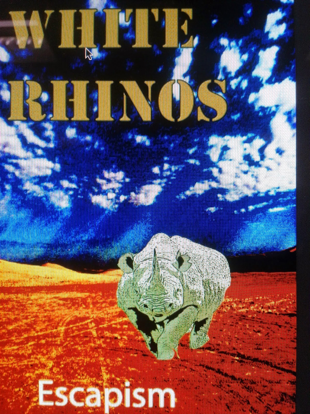
 As a group we decided on our final advert by bringing all four of our designs together and trying to make an advert with influences from all. With this we looked at the positives and negatives of each one and thought of ways in which they could be used to make the best advert, whilst not making it overwhelming. We then decided that we would try to incorporate the best parts of each advert to make our final one which would be much improved. We decided to use the background picture of one of our groups posters, the font of someone else and the final picture of the rhino from another. This will make the best possible advert as we have the whole group trying to improve the advert and giving all options and views on what will look best.
The colours we have used are mainly made up of blue, white and some darker shades such as pink and purple with the picture being made up of a cloudy sky. We have decided to use these colours as they are simple and give a less extreme version of our genre to the audience. Many of our personal adverts had bright florescent colours which stand out to the audience, however we believed that this may put some people who are unfamiliar with the genre off from buying the music. Furthermore the colours give a sense of the album in that there is a range of emotions in the music video, and that there are colours which are opposite in black and white. This is also a way in which we promote the artist through these colours to show his emotions in the video. These colours will appeal to our target audience as they are a less extreme version of some of the themes of psychedelic rock, yet appeal to both people who are fans and those that are unfamiliar. This will have a big impact and will help with the eye catching colours if someone is just buying and will be attracted to buying the album.
This will appeal to our target audience very well in many ways , for example the rhino in the clouds give a clear indication that it is a psychedelic rock album, and that it is something they may be interested in due to the surreal image. Furthermore they will like the use of colours as again it shows them the genre and gives it a dreamy look which give the impression that the viewer is on psychedelic drugs. This will help attract them whilst not being so extreme that people who are unfamiliar with the genre cannot but the album , this will increase the possible sales and target audience.
In the advert we have been conventional to the genre of psychedelic rock through ways such as the colour and the images. For example with the colours used, they are conventional to the genre in that they give the impression of psychedelic drugs to the viewer of the advert, which is a key part of the genre as a whole. The second is the image which is of a rhino being made up of the clouds, yet it has a clear outline. This could be part of the effects of the drugs and yet has a connection with the name of the band which gives it a connection with the band.
The images used may be very unusual in that there is the relatively normal background of the sky and clouds which could be used in many other music videos. However the rhino brings a unusual sense to the video in that it could be like a dream or a person on psychedelic drugs. We have used these images so that the audience can see that it is a psychedelic rock album yet not too extreme to alienate the people who may not be fans of the genre. This would make it more attractive as a magazine advert whilst still promoting the artist in that it shows the band name in the form of an image which may be more memorable than a simple title used.
The layout and design of the poster is very simple with a picture of a sky background being the main focus of the advert. At the top of the advert is the name of the band "White Rhino which is the main focus of the advert to try to get the audience to remember the band. At the bottom is the name of the album which is "Lonerism" as this is another main focus as this is what will be sold, however it could be seen as not as important as the band name. The font that was used is bold and makes the information clear to see if the audience was not specially looking at the advert. Furthermore this font could make the information more memorable if the people are not familiar with the band.
 Overall Luke's advert was simply but effective with getting the necessary information across to the audience reading the advert. Furthermore it gives our magazine advert a cleaner look than other people advert which used many editing techniques, which could possibly alienate the audience. We have taken the background of the advert from Luke's own advert , which is a sky background with whisps of cloud. We also used his font and title which we believed reflected the simplicity of the advert and stood out. The rest of the advert was re done with things such as using the picture of a rhino incorporated into the clouds , as if the clouds have made up the rhino. We have taken most od the inspiration for our magazine advert from looks and we belive that it was the best out of the four.
 In all the advert by Harry is poor for many reasons , such as not being able to clearly read the name of the band which is vital. Without this the audience do not know who the band is and are unlikely to be interested in buying any music from them. Another reason as to why it is poor is the overcomplicated colours which would overwhelm anybody reading the advert and would put them off from buying the album. One redeeming factor is that the advert is conventional to the genre , however is too extreme and would alienate possible fans of the artist

In conclusion I believe that our final advert adheres to the conventions of psychedelic rock yet does not go too extreme with the editing and colours. Furthermore the small amount of editing used makes it appear unusual enough so that it can be identified as a psychedelic rock album, so overall it does adhere to the conventions of the genre. This makes it the best balance as it will attract fans of the genre who may buy the album, but also people unfamiliar with this genre of music who may buy it as well. This will make it focus on the target audience which will help sales of the album whilst possibly being able to attract people who do not know of the genre.
Overall working as a group was easy and effective, we agreed on nearly everything that we should do and if we didn't we weighed up the positives and negatives of each option.We worked together well in teams completing tasks which made making the advert quicker, overall it was simple to work in our groups and we made an effective advert together.
.
.
As a group we decided on our final advert by bringing all four of our designs together and trying to make an advert with influences from all. With this we looked at the positives and negatives of each one and thought of ways in which they could be used to make the best advert, whilst not making it overwhelming. We then decided that we would try to incorporate the best parts of each advert to make our final one which would be much improved. We decided to use the background picture of one of our groups posters, the font of someone else and the final picture of the rhino from another. This will make the best possible advert as we have the whole group trying to improve the advert and giving all options and views on what will look best.The colours we have used are mainly made up of blue, white and some darker shades such as pink and purple with the picture being made up of a cloudy sky. We have decided to use these colours as they are simple and give a less extreme version of our genre to the audience. Many of our personal adverts had bright florescent colours which stand out to the audience, however we believed that this may put some people who are unfamiliar with the genre off from buying the music. Furthermore the colours give a sense of the album in that there is a range of emotions in the music video, and that there are colours which are opposite in black and white. This is also a way in which we promote the artist through these colours to show his emotions in the video. These colours will appeal to our target audience as they are a less extreme version of some of the themes of psychedelic rock, yet appeal to both people who are fans and those that are unfamiliar. This will have a big impact and will help with the eye catching colours if someone is just buying and will be attracted to buying the album.
This will appeal to our target audience very well in many ways , for example the rhino in the clouds give a clear indication that it is a psychedelic rock album, and that it is something they may be interested in due to the surreal image. Furthermore they will like the use of colours as again it shows them the genre and gives it a dreamy look which give the impression that the viewer is on psychedelic drugs. This will help attract them whilst not being so extreme that people who are unfamiliar with the genre cannot but the album , this will increase the possible sales and target audience.
In the advert we have been conventional to the genre of psychedelic rock through ways such as the colour and the images. For example with the colours used, they are conventional to the genre in that they give the impression of psychedelic drugs to the viewer of the advert, which is a key part of the genre as a whole. The second is the image which is of a rhino being made up of the clouds, yet it has a clear outline. This could be part of the effects of the drugs and yet has a connection with the name of the band which gives it a connection with the band.
The images used may be very unusual in that there is the relatively normal background of the sky and clouds which could be used in many other music videos. However the rhino brings a unusual sense to the video in that it could be like a dream or a person on psychedelic drugs. We have used these images so that the audience can see that it is a psychedelic rock album yet not too extreme to alienate the people who may not be fans of the genre. This would make it more attractive as a magazine advert whilst still promoting the artist in that it shows the band name in the form of an image which may be more memorable than a simple title used.
The layout and design of the poster is very simple with a picture of a sky background being the main focus of the advert. At the top of the advert is the name of the band "White Rhino which is the main focus of the advert to try to get the audience to remember the band. At the bottom is the name of the album which is "Lonerism" as this is another main focus as this is what will be sold, however it could be seen as not as important as the band name. The font that was used is bold and makes the information clear to see if the audience was not specially looking at the advert. Furthermore this font could make the information more memorable if the people are not familiar with the band.
Overall I believe that my own advert was not very good, but managed to get all the necessary information across. I believe the image I used was good , yet I over edited it having seen other psychedelic rock adverts and I used extensive colours to make it eye catching. The rhino I included to give something memorable although I believe it again looks over edited and although it may be conventional, I am not happy with the way it looks. I am unsure about the font on the sub title and would like to later that to the same font as the main title. In conclusion I had a good base idea yet I over complicated it and used to much editing and texture on it.
In conclusion I believe that our final advert adheres to the conventions of psychedelic rock yet does not go too extreme with the editing and colours. Furthermore the small amount of editing used makes it appear unusual enough so that it can be identified as a psychedelic rock album, so overall it does adhere to the conventions of the genre. This makes it the best balance as it will attract fans of the genre who may buy the album, but also people unfamiliar with this genre of music who may buy it as well. This will make it focus on the target audience which will help sales of the album whilst possibly being able to attract people who do not know of the genre.
Overall working as a group was easy and effective, we agreed on nearly everything that we should do and if we didn't we weighed up the positives and negatives of each option.We worked together well in teams completing tasks which made making the advert quicker, overall it was simple to work in our groups and we made an effective advert together.
.
.

.jpg)


.jpg)