I have created my own magazine advert so that I can promote the song and music video which we have made as a group. The reason that I have created an individual advert first is so that all of my own ideas are on a advert before we start our combined advert as a group. We would be taking the best ideas from all of our groups adverts and then making one that best suites our music video, and is better than all of ours individually.
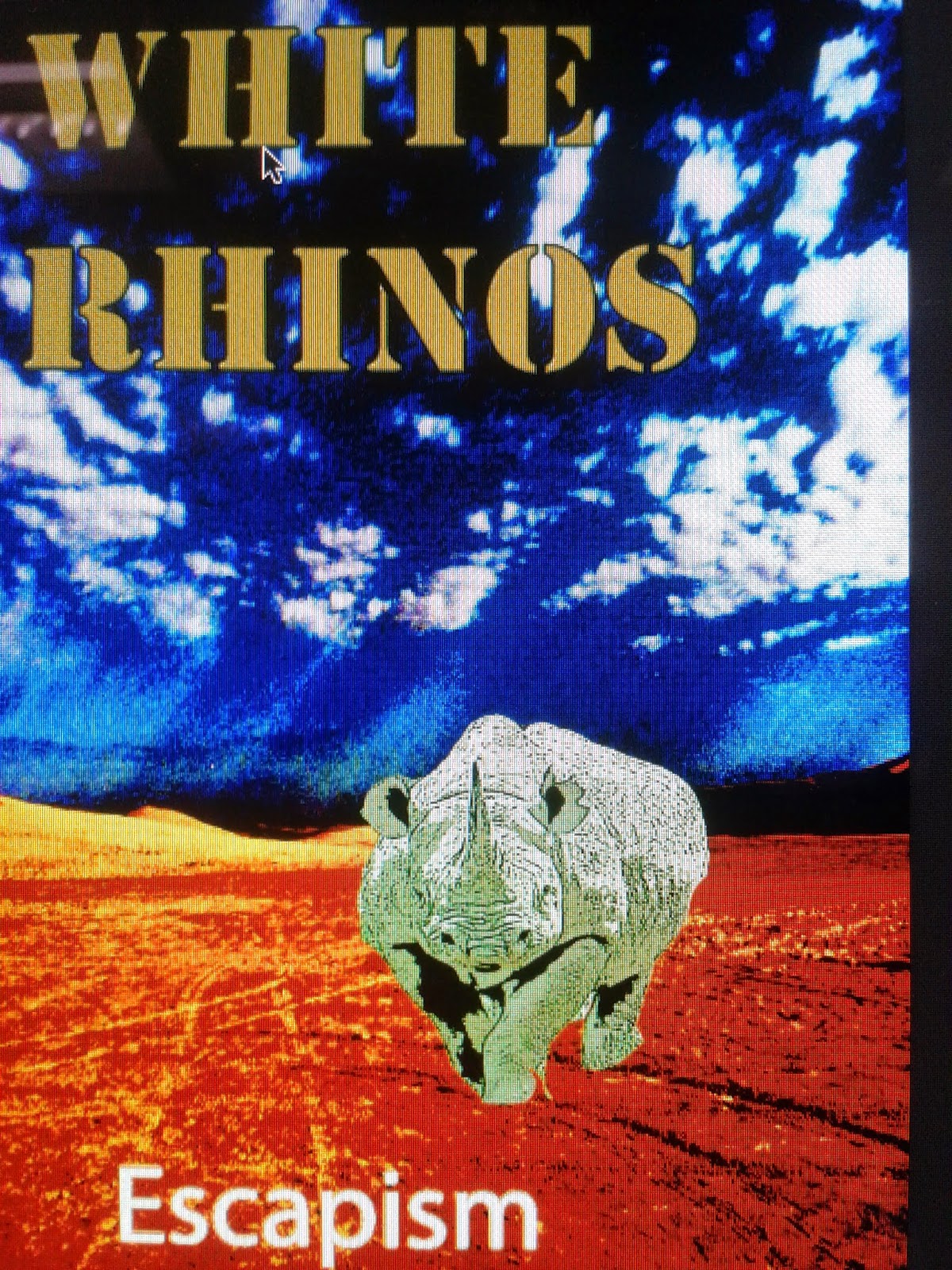
I have decided to use these particular colours in my poster so that it is eye catching and stands out against other magazine adverts, this would also help promoting the artist as it brings attention to the artist through the bright colours.. This would also make the readers much more likely to buy the music from the magazine advert as it is more memorable. Furthermore as the genre of the music is psychedelic rock I wanted to keep the advert conventional with the bright and vivid colours which would make it appeal to the fans of the genre already. However I have not made the advert too extreme as this would alienate the people who like a more mainstream genre which would lose the song sales. Additionally as the colours are bright it reflects the artist and his songs which are about surreal situations and being unique which we can see as there are few adverts that are this eye-catching.
Overall I have conformed to the genre of psychedelic rock through the ways in which the advert presents itself to the audience. Firstly the background and location is of a very distant and unique location which is very conventional to the genre, this is used as it reflects the distance between the artist and other people and the uniqueness that the artist has. This is a location which few people have visited so we can see the separation between the artist and normality. Another conventional part of the advert is the use of bright colours which are used in nearly everything in the magazine, from the letters to the background. This is conventional as another aspect of the genre is living in the moment and doing what you want, this is presented through the bright colours as few people would have them in an advert. Finally the surreality of having things such as a rhino in the advert , which is showing the chaos and randomness that is a very big part of the genre as the genre is being unique. This would attract the target audience greatly as although we use things that are very conventional they are not too extreme for people with a mainstream music taste not to like it.
The images that I have included in my video are very surreal, with the image of a rhino being the centre of the focus in that the name of the artist is the White Rhinos. I have decided to use this image as there is a connection with the band name which makes it more memorable for the audience , so they will be more likely to buy the music. Furthermore as the colouring of the image is surreal and bright the image is conventional to the genre of psychedelic rock whilst still attracting an audience that like the genre from before, also as it is eye catching the rhino will attract the people who do not know the genre. This is the only image I have used as I wanted to keep the design simple as using many images along with the eye catching colours would overwhelm the audience and possibly put them off the video.
The design and layout of the magazine advert is simple but very effective as it is informative to the audience and gives the sense of the music video to them. This is done by using the simple and bold main title which tells us the artist name "White Rhino" which contrast with the background , which makes it easier to see and is very eye catching when compared to other adverts. The sub title is of the album "Escapism" which is in the bottom left corner and gives the album name without being bigger than the band.
The typography I have used for the main title is bold and very simplistic but makes the band name stand out, furthermore the typography is very unique which also reflects the music video and the genre. This would attract the fans of the genre as it would have a connection with the genre, yet to people unfamiliar of the genre it would still stand out and be memorable to the audience. This would also promote the artist as it sets the artist apart from other bands who use mainstream typography, in that my own is so different. The typography on the sub title is much simpler as it would be hard to make out from any distance if we used a complicated font, furthermore this brings some normality to the advert which is needed as the rest of the video is very surreal.
The language which I have used is very simple and straight forward as people do not spend very long looking at adverts, which makes there need to be a lot of information from a small amount of text. This is why I have decided to use only the album name "Escapism" and the name of the artist "White Rhino", this helps both people who are familiar with the band as they know the band , however for people it gives everything they need to be able to buy the music from the album.
The connotations which I have used are very simple but are very conventional to the genre. These come in the form of having bright colours on the advert which is conventional to all things related to psychedelic rock. Another is the use of the exotic locations , which I have used in the form of a dessert valley, whereas other mainstream videos would use a beach or mansion. These conventions will appeal to fans of the genre as it is conventional which will interest them in that is is something that they already like, however it will also be memorable for people who do not know the genre but see it as unique. This will cover everybody who sees the advert and they both will be more likely to buy the album.
Some of the problems that I had while using Photoshop was changing the colours and textures of pictures that I wanted to use. As I was doing an advert for a psychedelic rock album I wanted to use unusual colours in my advert however I could not find the right tools to do this. I found out how to use the tools by using Youtube, which has tutorials on how to use colours and textures on Photoshop which gave instructions. This is how I overcame the problems that I had with using Photoshop. My strengths with Photoshop were using the pictures in creative ways and layering them on top of each other, I did this by using various tools which give different effects on the background and images used.
Overall I feel that I did follow the conventions of my genre with my own advert , I did this through using an unusual location, using bright colours and having an unusual theme to the advert. All of this keeps to the conventions of psychedelic rock and is far from any normal or mainstream advert. This would make it appeal to our target audience very well as we have kept enough of the conventions to be popular but not anything too extreme as this would put off potential fans of the genre and artist. I believe that my own advert would also help our groups as we can take the best ideas from all of our own individual adverts and combine them together into one which will be better than our individual ones. Furthermore if any of use has any mistakes these will be spotted and taken out of our final album advert.
You have provided a sound analysis of your individual advert, explaining clearly why you have incorporated all of your elements.
ReplyDeleteYou need to:
1) Make sure you state specifically what tools you struggled to use and why, and what tools you ended up using and why
2) Fully explain why this advert will appeal to your TA and why
3) Make sure you explain how elements used are conventional or not of the genre