Saturday, 3 January 2015

Group Digipak- Miss Georgiou

Group Digipak

When we started creating the digipak we decided that we would use the same methods as with the group advert in that we would pick the best panels from each of our own digipaks and try to make them into one. This would make the digipak easier to do in that we all had an idea of what we wanted and we could take elements from each digipak and use them. We did this by showing the group our personal digipak and then picking the best from the group. This would result in a much better digipak than if we were to start again with a blank canvas with all of our ideas.


With our first panel we decided to use Luke's front cover with a few alterations to make it fit in easier with the rest of the panels. The main thing we decided to change was have the rhino in the picture , with it in the clouds. We did this as we felt it would be memorable for the audience as it is so unusual and would stand out against more normal covers, whilst still giving the audience something to remember the band name with. Furthermore this would make it conventional with our genre of psychedelic rock in that it relates to the use of psychedelic drugs with surreal images. We also altered the colour so that it was a more prominent shade of purple and pink which we felt gave a sense of what the album will be like in that it is surreal and like a dream.  In this way we can see that we have definitely conformed to the genre of psychedelic rock in that we have used many of the characteristics that often appear in other conventional videos. We have done this as we feel it will intrigue people who are unfamiliar with the genre whilst interesting people who know of the genre from previous artists. The layout we have used is very simple, but we feel as a group that it is good and effective as we try to keep as much attention on the important things in the cover, which is the band name and the name of the album. The only other thing we believe is important is what impression the album cover gives, which is a surreal relaxed feeling that we believes gives a good impression of what the songs on the album are about. The typography used is very basic with a simple white font which makes it easy to read and readable at a distance which is needed with a cover. Furthermore we did not want to dominate the cover with a dark font as this would not be conventional with the genre of psychedelic rock. Overall it is very conventional to the genre and is a good way of showing the characteristics of the album. This in turn will promote the artists effectively in that it appeals to people who like the genre and those that are unfamiliar but will be intrigued by the unusualness of the design.


We have decided to use this picture as we believe that the audience would want to see the places that the artist has visited in the music video. Furthermore this is why The only part of this picture which we changed was some of the contrast in the editing , which we did to try to keep a theme with some of the other panels. The colours used are bright oranges and blues with dark contrasts of black and grey , which we feel gives a representation of the artist and song in that the artist has such mixed feelings. This will also appeal to the audience in it will make the audience see the images of how the artist sees them in the video. The image is of the view from outside Liverpool street station and we have used this as it gives the audience an opportunity to have a better view at the various images that are seen in the video. The layout of the panel is very simple with just a picture of a view from the artist point of view.There is no text or writing in this panel as we felt we wanted the audience to focus purely on the image. This is very conventional with the genre of psychedelic  rock in that it uses bright vivid colours, which are used as it often represents the use of drugs on images such as with the contrast on our video. Additionally the image is very surreal with a image that is which unusual and has a different perspective.  This picture was taken from Harrys digipak with only a small amount of change, so we have been successful in making it into our group digipak. One possible weakness we felt was that the image did not show the artist in any way , which may not help with promoting him.
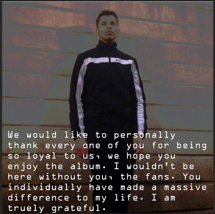

We have decied to use this panel as we believe that it gives the audience a personal connection with artist through the personally written message from the artist. This will bring a bigger connection which may lead to the fans liking the artist more and buying more of the artists music and merchandise. The colours we have used in this slide are black and white as we have tried to keep the focus on the message in this panel , this will help with the audience focus on the text. This also can be a connotation with the feelings of anger and sadness with the artist being confused and not knowing what to do.  This panel is unconventional to the genre as it uses no unusual imagery and no florescent colours which are very conventional and the basis in which we can clearly see if it is conventional. The image used is simple in that it is our artist looking away from the camera, we have used this as we believe it brings a sense of connection between the artist and fans in that they can see him , yet brings a distance in that he is not looking at them. Furthermore we did not want to take any focus away from the text so we have used a image with only a brick background , this is also why the picture is partly faded. The layout is quite simple with the text being at the artists feet and having the artist as the second focus in the picture yet still in the middle, this brings the attention forward with the text. The typography is simple yet different with a easy to read font that is different from the title as we wanted it to be as if the artist was saying this to the audience. The language used is quite formal and yet still informal enough for you to feel a connection with the artist, it is very thankful and personal with things such as "I am truly grateful" and "you individually have made a difference". This brings a very personal connection between the artist and audience and only strengthens the audiences devotion to the artist, which will hopefully lead to more sales. This image was taken from my own digipak and slightly altered with the personal message being made much longer and toning down the colours to try to focus the audiences attention on the message. This is a main way in which we promote the artist as it gives a meaning to the audience for them in supporting the artist and buying the digipak.


We have decided to use this image as again it is a location of where the artist has been and a image which many people may not have seen as it is not a conventional background. We have specifically used this place as it is the point that we use the time laps with the artist looking at his phone hoping his girlfriend calls, so we try to remind the audience of this point. The colours in this image are very bright with lots of white and yellow , these contrast very well and again can give the connotation that the artist has a range of emotions going on at this point. Furthermore this is very conventional with the genre of psychedelic rock in that the colours are as if the viewer is on a psychedelic drug which gives an insight into the artists view. Furthermore with all the people being blurred this is a way in which it is conventional as in many other psychedelic rock videos they refrain from showing faces as it brings a normality to the image. This was taken from my own digipak and no changes were made from the original to the group digipak , overall we all liked this picture and felt it was a success. However it does not promote the artist as much as some of our other panels  , although overall we all liked the effect the image had.


We decided to use this image as we felt it brought a normality to the digipak which we wanted , and was not too extreme for the CD which we wanted to have a more natural look. The colours we have used are simple blue and white which give it a unedited look and make it much easier to look at than many of the other panels in the digipak. Furthermore if any of the audience were unfamiliar with the digipak this would make them feel some sense of normality , and so the digipak can have a wider target audience. The conventions for psychedelic rock are completely subverted in this panel as it has simple and light colouring , no editing and a plain title. The image we have used was from Luke's digipak and is of a bright cloudy sky , and is the same sky as the front panel yet with no editing and no rhino in it, we felt that this was the best possible image. It almost brings the audience back to reality with the plain colours, which are a complete juxtaposition compared to the other highly edited panels. The layout is incredibly simple with  the name of the band and the title of the album on the CD , we have done this as it makes it easy to identity and yet has differences from the digipak. The typography is extremely simple with a clean white font which goes well with the background of similar colours , and yet can be seen but does not need to be as bold as the front panel. Overall we used this as it is a very pleasant simple panel which looks good and gives a difference from the rest of the digipak.

The final panel is one of our best with it having many elements that make up our genre and points which make it stand out. This was a design from Harry and we used it with very little changes having to be made, so it was a overall success. The colors used are dim with blacks, grey and browns being the predominant colours with some very bright parts such as with the white water fountains. This gives it an almost eerie effect and with the cartoonist style bringing out colours that would otherwise have been much less impressive. The contrasts also draw people to the light with the song names which we wanted with it being the back panel and which people would especially be looking at. The conventions in the panel are supported with the use of the unusual colour scheme and the different design with the almost painted image. Furthermore the image has bright colours in parts and very dark in other which is also a convention as it can represent the view of a person on psychedelic drugs.  The image used is very good as we can see the artist and he is looking directly at the camera which brings a personal connection , whilst him being in the corner of the image so still distant. Furthermore we can see the into the distance which gives the image more interest to the audience while reading the back. The layout is simple with the names of the songs on the album being easy to read positioned on the brick wall, this makes it fit in well with the picture. Furthermore it is readable and yet is not dominating the picture so we can get more meaning on the back panel. The typography is simple with a white font which is easily readable and stands out against the dark background, this will make it better for a person to read if they glance at it.This will appeal to our target audience in that is is conventional to the genre yet not so extreme as to put them off but intrigue them. Furthermore it will promote the artist by the audience being able to see his face in the back panel of the , this may help with the sales of the digipak.

Strengths and Weaknesses of groups digipaks :

Luke - Luke's digipak was simple yet effective with using minimal editing and relying on the quality of the pictures for the digipak. The pictures were visually very impressive however they may not conform to the genre which focuses on lots of editing and bright colours. Some things that are good however is the text which is coherant and easy to read and the picture quality is very good.

Harry- Harry's digipak I believe is over complicated with too much editing used and it being used in a way that is not very tasteful. The editing is so extensive that it hurts your eyes whilst looking at it and may put people off from actually buying it. Although the editing used was extensive the font was consistent and good throughout and he did use appropriate images, and he was conventional to the genre.

Overall our digipak somewhat conforms to the genre in different ways , for example we do use bright colours in many of our panels which is conventional, however we also use very dark contrasts. Another example is that we use very surreal images such as with panel one but panel three is very ordinary , this shows how we have been both conventional and subversive to the genre. I believe that this will be very attractive to our target audience as we can cater for people who are unfamiliar with the genre in that they will not be scared away with the extreme conventions of psychedelic rock. Although it would also appeal to people who are also familiar with the genre as they can clearly see that it conforms in some ways to the genre. 

Overall we found working as a group very easy , we had worked together before and we followed the same processes that we have used before. This has made it quick and easy to finish the project and we have done it effectively as a group. Everyone had their ideas heard and we all agreed on what was the best option and that is how we decided on decisions. Everyone cooperated and we all contributed with ideas and time toward finish the project.


Music Video Rough Cut- Miss Georgiou

Audience feedback is vital to any production as pleasing the audience is the main focus of what the video aims at doing, and furthermore with the feedback the video can be altered for the target audience which will cater for them more. If the video is well suited to the audience and it fills their requirements then they will likely spend more money on the artists music and merchandise which will make more profit for the artist and record label. Additionally if the audience like the music video then it will become more popular through ways such as social media and word of mouth which can further increase the popularity and sales of the artist. This makes our own rough cut essential as we can show it to people, and our target audience, to get their opinions on the video. From there we can see how they have responded and what changes that they have suggested to improve our video and from there we can implement the changes. We will then be catering for our target audience and our video will be much more successful for taking on feedback.

We received our feedback by screening our video to focus groups who wrote down the positives, negatives and things that needed to improve on overall. This is a very good method as we get more accurate results as people have seen the video recently and have the option to think about their decision before giving the feedback. This makes it much more useful than a questionnaire as people would often put untrue answers as they have limited options of choice, furthermore people often want to do a questionnaire quickly and try to get it over which may make it inaccurate again. However we still used a questionnaire at the beginning of the making of our video as it gives us a clear set idea of  what our target audience wants, with the information coming from a range of people. Additionally with our final rough cut of the video we uploaded it to youtube , this enabled us to get direct feedback from our audience which can  give us a first hand indication if they like the video.

This feedback would benefit the production greatly in that we would be able to change our video to make it more suitable and enjoyable for the audience. This would result in a more successful video as it would be more enjoyable for a large amount of people and so would be popular which would result in more sales for the artists. This would benefit the music industry in many ways such as it improving the quality of the productions that are made and so increase the credibility of the the industry. This would improve the relationship between the audience and the artists which would generate more money for the industry as a whole. Furthermore it would improve the recognition and popularity of our chosen genre of psychedelic rock as it is very unique and has a limited fan base. Which could possibly lead to more psychedelic rock bands being made popular, and possibly genre base record labels being set up. Finally the improved quality of the production will improve the satisfaction of the audience, which will make the demand increase for the industry which  will boost the industry as a whole and will grow.

Some of the positives that we received from the comments for our video were :

The variety of camera shots used
The narrative of the music video
The extensive use of editing and the styles used

Possible negatives of the video from the YouTube comments were :

The length of some shots was too long
Lip syncing being slightly out
Lack of performance in the video

From these comments we will try to improve the video by include more footage of the artist in the video doing activities related to the narrative. This will solve both the problems of  the length of the shots in that we can shorten them and have others which will take up the remaining time that will be used. Furthermore the new shots and footage will add more action to the video and be more interesting for the audience, which was indicated as a fault. After this we would then go to editing and improve the lip syncing which will cover all of our weaknesses in the video. This will improve our video by catering to the audiences comments which will make the video more interesting and impressive to the audience.


Thursday, 18 December 2014

Group Magazine Advert - Miss Miller

Group Magazine advert

As a group we decided on our final advert by bringing all four of our designs together and trying to make an advert with influences from all. With this we looked at the positives and negatives of each one and thought of ways in which they could be used to make the best advert, whilst not making it overwhelming. We then decided that we would try to incorporate the best parts of each advert to make our final one which would be much improved. We decided to use the background picture of one of our groups posters, the font of someone else and the final picture of the rhino from another. This will make the best possible advert as we have the whole group trying to improve the advert and giving all options and views on what will look best.

The colours we have used are mainly made up of blue, white and some darker shades such as pink and purple with the picture being made up of a cloudy sky. We have decided to use these colours as they are simple and give a less extreme version of our genre to the audience. Many of our personal adverts had bright florescent colours which stand out to the audience, however we believed that this may put some people who are unfamiliar with the genre off from buying the music. Furthermore the colours give a sense of the album in that there is a range of emotions in the music video, and that there are colours which are opposite in black and white. This is also a way in which we promote the artist through these colours to show his emotions in the video.  These colours will appeal to our target audience as they are a less extreme version of some of the themes of psychedelic rock, yet appeal to both people who are fans and those that are unfamiliar. This will have a big impact and will help with the eye catching colours if someone is just buying and will be attracted to buying the album.

This will appeal to our target audience very well in many ways , for example the rhino in the clouds give a clear indication that it is a psychedelic rock album, and that it is something they may be interested in due to the surreal image. Furthermore they will like the use of colours as again it shows them the genre and gives it a dreamy look which give the impression that the viewer is on psychedelic drugs. This will help attract them whilst not being so extreme that people who are unfamiliar with the genre cannot but the album , this will increase the possible sales and target audience.

In the advert we have been conventional to the genre of psychedelic rock through ways such as the colour and the images. For example with the colours used, they are conventional to the genre in that they give the impression of psychedelic drugs to the viewer of the advert, which is a key part of the genre as a whole. The second is the image which is of a rhino being made up of the clouds, yet it has a clear outline. This could be part of the effects of the drugs and yet has a connection with the name of the band which gives it a connection with the band.

The images used may be very unusual in that there is the relatively normal background of the sky and clouds which could be used in many other music videos. However the rhino brings a unusual sense to the video in that it could be like a dream or a person on psychedelic drugs. We have used these images so that the audience can see that it is a psychedelic rock album yet not too extreme to alienate the people who may not be fans of the genre. This would make it more attractive as a magazine advert whilst still promoting the artist in that it shows the band name in the form of an image which may be more memorable than a simple title used.

The layout and design of the poster is very simple with a picture of a sky background being the main focus of the advert. At the top of the advert is the name of the band  "White Rhino which is the main focus of the advert to try to get the audience to remember the band. At the bottom is the name of the album which is "Lonerism" as this is another main focus as this is what will be sold, however it could be seen as not as important as the band name. The font that was used is bold and makes the information clear to see if the audience was not specially looking at the advert. Furthermore this font could make the information more memorable if the people are not familiar with the band.

Overall Luke's advert was simply but effective with getting the necessary information across to the audience reading the advert. Furthermore it gives our magazine advert a cleaner look than other people advert which used many editing techniques, which could possibly alienate the audience.   We have taken the background of the advert from Luke's own advert , which is a sky background with whisps of cloud. We also used his font and title which we believed reflected the simplicity of the advert and stood out. The rest of the advert was re done with things such as using the picture of a rhino incorporated into the clouds , as if the clouds have made up the rhino. We have taken most od the inspiration for our magazine advert from looks and we belive that it was the best out of the four.

In all the advert by Harry is poor for many reasons , such as not being able to clearly read the name of the band which is vital. Without this the audience do not know who the band is and are unlikely to be interested in buying any music from them. Another reason as to why it is poor is the overcomplicated colours which would overwhelm anybody reading the advert and would put them off from buying the album. One redeeming factor is that the advert is conventional to the genre , however is too extreme and would alienate possible fans of the artist

Overall I believe that my own advert was not very good, but managed to get all the necessary information across. I believe the image I used was good , yet I over edited it having seen other psychedelic rock adverts and I used extensive colours to make it eye catching. The rhino I included to give something memorable although I believe it again looks over edited and although it may be conventional, I am not happy with the way it looks. I am unsure about the font on the sub title and would like to later that to the same font as the main title. In conclusion I had a good base idea yet I over complicated it and used to much editing and texture on it. 

In conclusion I believe that our final advert adheres to the conventions of psychedelic rock yet does not go too extreme with the editing and colours. Furthermore  the small amount of editing used makes it appear unusual enough so that it can be identified as a psychedelic rock album, so overall it does adhere to the conventions of the genre.  This makes it the best balance as it will attract fans of the genre who may buy the album, but also people unfamiliar with this genre of music who may buy it as well. This will make it focus on the target audience which will help sales of the album whilst possibly being able to attract people who do not know of the genre.

Overall working as a group was easy and effective, we agreed on nearly everything that we should do and if we didn't we weighed up the positives and negatives of each option.We worked together well in teams completing tasks which made making the advert quicker, overall it was simple to work in our groups and we made an effective advert together.
.
.

Wednesday, 10 December 2014

Individual Digipak- Miss Miller

Individual Digipak

I have created an individual digipak so that I can promote and present my groups music video to the audience who would buy the music. The reason I have done it individually at first is so that I can use all of my own ideas and have no outside interference, and when we come together as a group to make our final digipak we can take the best ideas from each and use them to create a better digipak. This would result in a much improved digipak than if we were to do it individually as we have more people to give their opinions and views, this would help with constructive criticisms.

I have decided to use these particular colours in the digipak as I believe that they are very conventional to the genre whilst making the digipak interesting to the audience. This is done by using high levels of contrast on pictures which accentuate lights parts of the picture , which contrasts against the very dark patches, which was done on Photoshop. This appeals to the target audience very much as it appeals to the uniqueness of the genre whilst still being mainstream enough that it does not put off possible fans of the genre. Furthermore the colours of the digipak reflect the song in that the black and white shows the mood of the artist and how the narrative of the music video is used with him being happy and then very depressed.

Overall the digipak is very conventional to the genre of psychedelic rock because of many things which we have used in the digipak are used in other conventional digipaks.. One example of how it is conventional is the distorted images which we have used in the digipak , this makes the image unique and very different from more mainstream genres which do not use . Furthermore the distorted images can be related to the psychedelic drugs that feature heavily in the genre which can be a way that the genre can show the effects to the audience. Another way that the digipak is conventional is that the colours used are very bright and vivid which are again related to the genre in that the genre is about doing what the individual wants and being unique. Additionally with these bright colours and very dark images side by side it can show the mood of the artist and of the overall album which gives the audience a preconceived idea.

The images which I have used are of very iconic scenes and backgrounds, however they do have things changed such as the contrast being very high which results in very bright parts alongside very dark parts. I have decided to use the images of Canary Wharf and Liverpool Street as they are recognizable to the audience yet there is something unusual about them with the editing. This is the connection with the music video in that we are seeing the scenery of what the artist sees in the video and what it would look like to him after he has taken the psychedelic drugs. This brings a connection between the audience and the artist as they can now see through his eyes which will help the artist keep them as fans. Other images used are of the artist leaning against a wall looking away from the camera, I have used this so the fans can identify the artist which will help if someone does not know the artist well. Furthermore we we can see he is alone and his facial expression is one of being sad and confused, which also shows the audience the mood of the song. I hope this will get the audience to care more for the artist as it helps visually and he looks quite different and distant than a normal person leaning on the wall.

The layout and design of the digipak is very simple , however it gives enough information and high quality pictures to the audience for the audience to like the digipak. The first panel of the digipak has the image of a rhino whilst above it is the title of " White Rhinos" and the album name of "Lonerism", this gives everything that is needed on the front cover whilst still making it stand out. The second panel is the image of Liverpool street with the contrast very high , this is showing the surroundings through artist eyes and helps the audience understand his perspective. The third panel is where the CD will be held and is a simple desighn of having the title and the outline of a rhino on the CD. The fourth panel has the image of Canary Wharf and is again the same as panel two with the hugely contrasted image , however in this image the background is much more impressive. The fifth panel is the personal message from the artist  which simply reads " thank you , from the White Rhinos", with the picture of the artist looking away from the camera, and with this picture the artists is in black and white. The final panel is another image of Canary Wharf with the names of the songs in the album along the side of the main skyscraper. This appeals to the target audience as the fans of the genre want a unique digipak which I have created , but have still out more mainstream things that would not normally be included such as a personal message.

The typography used is quite varied and many different fonts are used, the main title is bold which is so that the audience immediately can see who the artist is if they were going to buy it. In a smaller font is the album name "Lonerism" which is just as essential and very important to give fans an idea of if it is a new allbum and if they will buy it. The font on the third panel CD is again the name of the artist "White Rhino" which is bent around the hole in the CD , the font is very thick and plain black which is simple yet shows people who the artist is immediately without any confusion. The fifth panel has the words" Thank You" in individual block of colour which gives the words more power and helps them stand out and then it is signed " White Rhinos" in a hand written font. This will bring a connection between the audience and artist and helps the artist to keep their fans dedicated to them. The last panel has the simple white font of the song names of the album such as the songs "Feels like we only go backwards" or "Led Zeppelin". This font stands out against the dark background which I have used to make the names of the songs easier to see and they now can be easily seen on the back. This makes it appeal to the target audience as the information is easy to read and stands out against the background of the digipak.

The language used throughout the digipak is minimal and I have done this as to not take away the attention from the images which have been used. The only language used in the whole of the digipak are the band name "White Rhino" , the album name " Lonerism" and the personal message from the artist. This brings the focus onto the actual music and attracts the target audience as other artist of the genre have minimal information. This is very conventional to the genre as psychedelic rock artist do not like to give too much information away, furthermore it promotes the artist to the target audience in that it goes with other very successful artists.

The connotations of the digipak are very easy to see , one example of this is the black and white image of the artist, this is meant to show the moods of the artist in that he has gone from being very happy to sad very quickly. Another connotation is that with the distorted images of the scenery in that we can tell that the artist is not thinking right when he is looking at the city and that he is on drugs.Furthermore as this is a main part of the genre it can be seen as also being conventional to the genre of psychedelic rock.

I believe that my own digipak does appeal to the target audience which I am targeting , which is fans of the psychedelic genre. The conventions of the genre have been followed such as using bright colours in the images, this specifically targets the audience as they know what other artists have done and we are using them as inspiration for our own music video and my own digipak. Furthermore this digipak could appeal to people who are not familiar with the genre as it is not too extreme to alienate them from buying the digipak, which can sometimes happen with other artist from the same genre.

I used Photoshop relatively well with using contrasts and altering pictures being my strengths and designing the pictures as my weakness as it took a long time. My only serious problem happened when I was unable to use layers correctly but I managed to find out how to correct the problem using a YouTube tutorial.  However overall there were few problems and in the end I managed to become proficient at using it after having to learn from scratch how to do things, having never used it before in any other way. One of thing things I created was the front colors using the unusual background along with the bright pink rhino I believe it is very conventional to our genre, and the best slide out of the six.

I believe that creating an individual digipak will definitely help our groups final digipak as we can take a range of ideas from all of our digipaks and then make them into one. This will make the final digipak better as we can take the best bits from each digipak which will then be better than if an individual as we will have more people input. Furthermore if any of us have mistakes then the rest of the group can point this out and correct the problem.

Wednesday, 3 December 2014

Individual magazine advert- Miss Miller

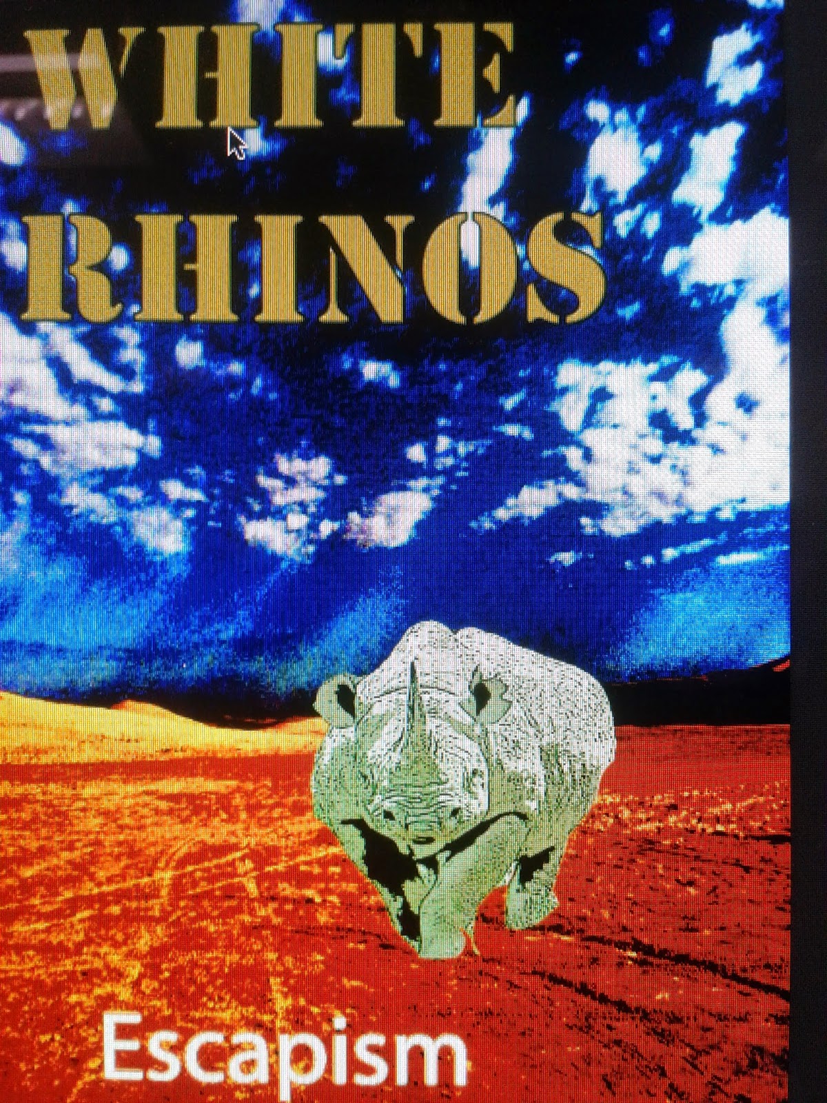
I have created my own magazine advert so that I can promote the song and music video which we have made as a group. The reason that I have created an individual advert first is so that all of my own ideas are on a advert before we start our combined advert as a group. We would be taking the best ideas from all of our groups adverts and then making one that best suites our music video, and is better than all of ours individually.

I have decided to use these particular colours in my poster so that it is eye catching and stands out against other magazine adverts, this would also help promoting the artist as it brings attention to the artist through the bright colours.. This would also make the readers much more likely to buy the music from the magazine advert as it is more memorable. Furthermore as the genre of the music is psychedelic rock I wanted to keep the advert conventional with the bright and vivid colours which would make it appeal to the fans of the genre already. However I have not made the advert too extreme as this would alienate the people who like a more mainstream genre which would lose the song sales. Additionally as the colours are bright it reflects the artist and his songs which are about surreal situations and being unique which we can see as there are few adverts that are this eye-catching.

Overall I have conformed to the genre of psychedelic rock through the ways in which the advert presents itself to the audience. Firstly the background and location is of a very distant and unique location which is very conventional to the genre, this is used as it reflects the distance between the artist and other people and the uniqueness that the artist has. This is a location which few people have visited so we can see the separation between the artist and normality. Another conventional part of the advert is the use of bright colours which are used in nearly everything in the magazine, from the letters to the background. This is conventional as another aspect of the genre is living in the moment and doing what you want, this is presented through the bright colours as few people would have them in an advert. Finally the surreality of having things such as a rhino in the advert , which is showing the chaos and randomness that is a very big part of the genre as the genre is being unique. This would attract the target audience greatly as although we use things that are very conventional they are not too extreme for people with a mainstream music taste not to like it.

The images that I have included in my video are very surreal, with the image of a rhino being the centre of the focus in that the name of the artist is the White Rhinos.  I have decided to use this image as there is a connection with the band name which makes it more memorable for the audience , so they will be more likely to buy the music. Furthermore as the colouring of the image is surreal and bright the image is conventional to the genre of psychedelic rock whilst still attracting an audience that like the genre from before, also as it is eye catching the rhino will attract the people who do not know the genre. This is the only image I have used as I wanted to keep the design simple as using many images along with the eye catching colours would overwhelm the audience and possibly put them off the video.

The design and layout of the magazine advert is simple but very effective as it is informative to the audience and gives the sense of the music video to them. This is done by using the simple and bold main title which tells us the artist name "White Rhino" which contrast with the background , which makes it easier to see and is very eye catching when compared to other adverts. The sub title is of the album "Escapism" which is in the bottom left corner and gives the album name without being bigger than the band.

The typography I have used for the main title is bold and very simplistic but makes the band name stand out, furthermore the typography is very unique which also  reflects the music video and the genre. This would attract the fans of the genre as it would have a connection with the genre, yet to people unfamiliar of the genre it would still stand out and be memorable to the audience. This would also promote the artist as it sets the artist apart from other bands who use mainstream typography, in that my own is so different. The typography on the sub title is much simpler as it would be hard to make out from any distance if we used a complicated font, furthermore this brings some normality to the advert which is needed as the rest of the video is very surreal.

The language which I have used is very simple and straight forward as people do not spend very long looking at adverts, which makes there need to be a lot of information from a small amount of text. This is why I have decided to use only the album name "Escapism" and the name of the artist "White Rhino", this helps both people who are familiar with the band as they know the band , however for people it gives everything they need to be able to buy the music from the album.

The connotations which I have used are very simple but are very conventional to the genre. These come in the form of having bright colours on the advert which is conventional to all things related to psychedelic rock. Another is the use of the exotic locations , which I have used in the form of a dessert valley, whereas other mainstream videos would use a beach or mansion. These conventions will appeal to fans of the genre as it is conventional which will interest them in that is is something that they already like, however it will also be memorable for people who do not know the genre but see it as unique. This will cover everybody who sees the advert and they both will be more likely to buy the album.

Some of the problems that I had while using Photoshop was changing the colours and textures of pictures that I wanted to use. As I was doing an advert for a psychedelic rock album I wanted to use unusual colours in my advert however I could not find the right tools to do this. I found out how to use the tools by using Youtube, which has tutorials on how to use colours and textures on Photoshop which gave instructions. This is how I overcame the problems that I had with using Photoshop. My strengths with Photoshop were using the pictures in creative ways and layering them on top of each other, I did this by using various tools which give different effects on the background and images used.

Overall I feel that I did follow the conventions of my genre with my own advert , I did this through using an unusual location, using bright colours and having an unusual theme to the advert. All of this keeps to the conventions of psychedelic rock and is far from any normal or mainstream advert. This would make it appeal to our target audience very well as we have kept enough of the conventions to be popular but not anything too extreme as this would put off potential fans of the genre and artist. I believe that my own advert would also help our groups as we can take the best ideas from all of our own individual adverts and combine them together into one which will be better than our individual ones. Furthermore if any of use has any mistakes these will be spotted and taken out of our final album advert.


Friday, 21 November 2014

Photo Shoot - Miss Miller

Photo Shoot 

The reason for us taking pictures was to put in our digipak which would give the buyers a sense that they have more of a connection with the band as they can see where we filmed the artist. This can be seen as we have used pictures from the locations that we have filmed at to give our digipak a more personal feel rather than a random exotic location and London is relatable for many people as many live around the surrounding area. While we were filming we took a variety of pictures so we can keep the intrest of the audience on the digipak and to show them the range of locations of where we filmed, this will also promote the artist and his songs as we can see him singing on location. This will also bring a connection with the artist and audience as they may have been to the same location as we have used well known areas.

I have taken this picture to use on the 4th panel of my digipak as it shows the location we were filming at which was the West Indian Quay with Canary Wharf in the background. This will show one of the main places that we filmed and I have used this image as it is one that only appears for a very short time in the video but I felt it was visually very impressive and deserved to be in my digipak. Furthermore it is instanly recognisable which makes it easy for the audience to relate to as the location has been visited by many people and they may recognise the place. This image would be subversive of our genre of psychedelic rock as a conventional location would be a very exotic location such as a beach , a dessert or a distant country. However we have used a iconic place in London that is not very exotic however it is just as impressive with the skyscrapers and fountains, so we have used a man made place instead of a more natural location. Furthermore many people have been to our location whereas a conventional location would be one in which few people have been before to bring new excitiment. I believe the best thing about the image is that it has so many things inside it with the fountains , huge skyscrapers alongside the bright lights and the clouds. This makes the picture very intresting and keep you focused as there is so much to look at. The main way that the image builds a relationship is by using an iconic location and area , which many people have been to and so they have been to the same place as the artist.


I have taken this picture to give the audience a clear idea of what the artist looks like which helps with identifying him. This will help with the recognition of the artist and make him more well known to his audience , which makes this image one of the most important. This will appear on the second panel of the digipak so when a buyer opens the digipak this will be one of the first images that they see. This can be seen as mainly subverisve with the genre of psychadelic rock, this is because most of the artist in the genre keep their faces well hidden and use other people in their images. They also often do not use as plain an image as I am but I feel that this would be more mainstream and attract a bigger audience. If we were to make all images conventional then the digipak may be too extreme and possibly put people. I think the best thing about this image is that the audience get to see the artist which will help them relate to him much better than with a mysterious person. This will make them bigger fans as they can actually idenitfy who the artist that they like is, however as he is still not looking at the camera it still brings a sense of distance between him and the audience.
 
This image was taken outside the main entrance to Liverpool Street station and shows the gerkin and many other buildings. I have taken this picture as it is the location where the artist gets into London and starts walking around,  and where most of the artists time is spent. I will use this on the 5th panel of the digipak as it has only one famous sight and maybe not as impressive as some of the other images which we have taken. Yet I belive it has significance as it is the place where the artsist journey starts in London. This image is again subversive as it does not include and exotic location or any extreme editing, however it could be seen as slightly conventional with the different lights which we can see in the image such as them being bright up close and dimmer further back. What I like about this image is that there are lots of things happening in the shot paticulary the people , there are people walking from the station, to thetation , people going shopping, people eating. This brings activity to the shot which would otherwise have been plain and boring which would make the image a waste for the digipak.This will help the relationship between the artist and the audience as the image is taken as though someone is looking on at location. This brings a connection as the artist and audience are seeing the same thing when he leaves the station.


This image was taken in the centre of the financial district in Canary Wharf and we chose to take the picture as this image is much simpler than the others and has no iconic landmark which the others have. This takes the attention away from London and focuses on the image and the things that are init such as the small fountains. I intend to use this on the third panel of the digipak to break up the pictures with the big backgrounds and lost of activity. I belive that this picture is conventional to the genre as it is using a less well known location which is very conventional whilst also haveing the fountains which bring an unusal light which is also typical of the genre, this is one of the only images in which we can see the genre coming through. I think the good thing about the image is that it is a intresting shot whilst not having anything iconic in the image , this makes it different from the other pictures which makes it part of the genre as it is unique. Furthermore I like the contrast between the nature of the trees and water with the man made giant structures which surround it, this could be the like the descions that that artist has had to make.
 
 
I found taking the pictures relativly easy as we took them whilst we were filming so we did not need to go back to any locations to take more pictures. Furthermore we took many pictures which would then allow us to pick the best and then use them , rather than taking pictures and finding out that they were no good. The only problem that we had with the pictures were that some of them were blurry and unclear at night, which we could not help as we had no better camera available and had to use our phones.
 
The pictures which we have taken represnt our artist as very distant as none of the images have people close to him or have very clear faces of the other people. However we do see him as relativly normal otherwise which makes him easier for the audience to relate to rather than a unlikeable strange person.
 
As individuals we have made our own advert and digipaks with our own ideas and thoughts being put into them. We will then bring all the ideas together and create an overall digipak and advert which will have a combination of ideas from all of us , which we will then brainstorm and put them into one. We will then see if we would like to change anything to improve them and then we will have our final finished product for our music video.
·     

·     


Monday, 17 November 2014

Initial group planning ideas - Miss Georgiou

The group that I am in includes three other people who are Harry Hyett, Jazz Chyriste, Luke Durrance.

In our first meeting as a group we discussed things such as which music genre we like and then the songs we like, we found out we like different music from many artists from Arctic Monkeys to Calvin Harris. Then we decided on the song and printed off the lyrics which we then annotate to work out the hidden meaning of the song and how the themes would help make our video. One way we can see this is that we would like to use the theme of going backwards in our song as it is a main theme in the song lyrics. We could show this to the audience by doing things such as  reversing film which is a way to show the theme.

There were 10 main points that our group discussed which we would would like to incorporate in our music video. These points are Mise en Scene, artists representation , cinematography, editing, style of music video, codes and conventions of the music video, target audience, music video theory, research carried out and inspirations and the annotations of the lyrics. This will be very useful as it sets out our plans for our video and will make our planning more focused which will prevent us from wasting time.

In the next meeting we applied for copyright from the record label that the artist we chose belongs to. This was done by emailing them explaining what we were doing and if they would give us permission to use the song for educational purposes.  After this we researched into the music genre which we had picked , which is psychedelic rock and the themes and conventions which are part of the genre. We had done this by researching other artist in the genre and what they had used in their own videos, which we could take inspiration from.

While doing this we had all started thinking about the outline of our music video and what we thought should be included. We agreed to do things such as stay conventional with the genre whilst trying to make it mainstream enough for people to watch. This would give us a big enough audience who would like our video which would help make our music video more successful

When I did my own research into the music genre I learnt many things about psychedelic rock, which I did not know the genre previously as is not a main stream genre of music. The main conventions are based around the use of psychedelic drugs and so are things such as bright colours, lots of editing and the use of very strange things happening in the music video. Other conventions which are not as prominent as these are things to do with the artist not showing their face and using lots of concepts within a video , these are things that are very unique to this genre.

We discussed what we wanted our music video to look like as a group , we did this by brainstorming ideas for a good narrative that is conventional to the genre. We split up the video into parts and after we had made the start we found that the rest of the video was easier as we could tell the narrative from that point. We also decided which shots and editing to use along the way , such as using a time lapse in a train station which we all agreed would look impressive.

After this we drew up the narrative of the video in a storyboards and had a clear idea of what we wanted to film and when, however we found when filming that there were better camera angles and new things to take shots of. This meant that we did not stick to our storyboard with everything however it did give us an outline of what camera angle and location we were going to use.

These meetings and discussions are vital for our group and the final music video as they help us improve the video to make it the best that it could be. If we have many people working on the same thing then we can see the things to keep and the things that need to be improved or cut from the video, this will make our video look as professional as possible. Furthermore as we have more people discussing things it can be done quicker as we would have everybody working on the same thing which would improve  the productivity of the group.

Overall our group worked very well together and all of our discussions and meetings were very productive. All of the meetings were successful as we all worked together in trying to complete the same task and there was little disagreement over these things, and if there was disagreement it would help us improving the final product. Furthermore everyone had contributed to the projects that the group was doing, with everyone contributing ideas and time to making the music video, so in conclusion the group worked very well together.